Friday, December 31, 2010

Tipping the Scale


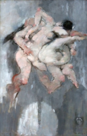
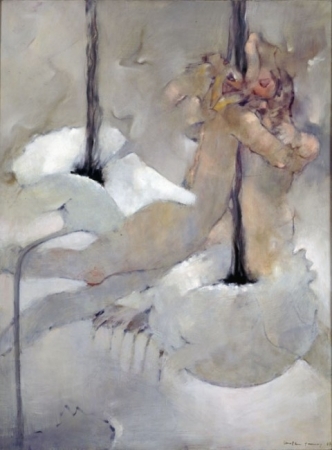
My art is about humanity and it's selfish tendencies. People put themselves first, it's a way of survival. This is especially evident is such an individualized culture as this. Think about skin and how every little piece is a cell that combines to create a whole. Now apply that to behavior. Every action, thought, decision, event; they all create who we are. An obvious metaphor, but I still enjoy how grotesque skin appears close up. I feel the same can be felt about humanity at it's most naked and desperate moments.

New years is about resolutions. And while most are broken, the effort and intent is still valuable. Next time, before you act, think about how your actions are affecting other people. If you say you're going to do something and other people are depending on you, it is not okay to flake for reasons other than emergencies. If you decide you're going to drive somewhere, and a person omits buying a ticket so they can catch a ride with you. You can't flake on them and force them to buy an overpriced train ticket that is not in how they budgeted their money for the next month. It is not okay. Not okay. Sorry, that was a blatant rant, but a relevant example of my art.

People my age are ridiculous. But I know older adults aren't anymore reasonable. This new years eve I have a bitter taste in my mouth when thinking about humanity and trust and reliance. That hope that I talk about in my artwork is being suffocated by frustration. I guess every once in a while you have to be emotive instead of rational.

I think we all can relate at times. My artwork is about harnessing that rationality. That struggle to hold onto it. That moment where, despite all reason and calm thought, you are still let down and making excuses for others is pointless. I think I know what my next project is going to be.

This new year, try and be a good person.

Thursday, December 30, 2010

Paper Cuts are the Worst


I think scribbles are beautiful. It's the thousand little lines trying to capture the perfect one.

Wednesday, December 29, 2010

Tuesday, December 28, 2010

Bought Frames Today!

My most recent book. And my most current artist statement. They're starting to be cohesive, to me at least. The book has two sentences repeated through the whole thing. "I'm trying to be a good person. I'm sure they're good people." It's about the process of reassurance I go through when struggling not to be a judgmental person. Bittersweet.

Humanity is a collection of relationships and interactions that invoke awe as well as disgust. It is beautiful, resilient and noble, while being selfish, unsightly, and weak. The existence of these contradictory qualities makes human nature a concept to be cherished and ridiculed. It is a journey of transient understanding through the act of living and reflection.

All my life I have struggled with the innate cruelty that seems to plague humans. I have tried to erase this idea and reassure myself that people are good, just merely misguided. I have done my best to withhold judgment, and live and let live. However, my obsessive quest to reaffirm a hopeful perspective has become a life long struggle.

My art is inspired by this internal battle to appreciate and believe in the beauty of humanity. It is full of doubts, struggles, and loss, but mostly it is full of hope. The imagery in my art is familiar but often unknown. I use abstract figurative forms to cultivate a nostalgic confusion. In addition, I use text to show the compulsive process of reaffirmation. I have found a lot of peace in accepting that I will never understand humanities conflicted nature. Understanding everything is not vital to my happiness, however watching, describing and exploring, is important in my life and in my art.

Sunday, December 19, 2010

Visit my Website.

Visit my Website!!

http://courtneyvoss.weebly.com/

I don't know if anyone would describe website design as a strength of mine, but I'm proud of it. Simple and functional. C'est suffit, n'est pas?

Wednesday, December 15, 2010

Peter Callesen


Website

Peter Callesen is a Danish Artist who takes a very relatable everyday object, an A4 size piece of paper and turns it into art. Once again, his work is playful, similar to Toles work. He is able to create something out of a blank piece of paper. His work is beautiful because it combines a very simple idea with a meticulous and fragile process.

Another thing I like about his work is his interaction with the frame. Often he uses box frames and pieces of paper sit smartly on the bottom of the frame. This makes the presentation part of the piece.

David Linneweh


Linnewehs work explores how humans gain meaning in their lives from the environment around them. He claims to question the idealism in American landscape my constructing and deconstructing landscapes through prints and paintings. People define themselves by the environment they choose, but cities decay over time and the pride behind them lives on.

I like Linneweh's work because of his use of texture and solid blocks of color. His work, although architecture in form and content, is not at all exact or measured. This leaves his landscapes appearing chaotic and unbalanced. I really like this because it evokes feeling. When looking at some of his work, you see a decaying cityscape. This aged look makes the content seem even more real.

Wassily Kandinsky

Kandinsky has been one of my favorite artists since highschool. His work explores the idea of automatic painting, the subconscious and improvisation. I think exploring the automatic and unprovoked imagery produced by humans is absolutely fascinating from a psychological perspective. His work came around the same time Freud was exploring the subconscious.

Kandinsky uses lots of color, straight edges and subtle shading. These non figurative combinations of shapes, texture and color lead the eye around the canvas. Every time you look at his work, there is something new to look at. They're just absolutely awesome to look at.

Kate Long Stevenson


website
I really like abstract painting purely for the aesthetic enjoyment of it. This is what I see in Stevenson's work. The ability to combiined color and form in an abstract meaningful way has always interested me. With Stevenson's work she creates the appearance of light behaving in an environment. Her yellows and whites bounce of other colors to create a world of movement. Stevenson's biggest influence in her work is music. She uses music to inspire her and create different rhythms and tempos in her work. This is very similar to the work of Kandinsky, one of my favorite artists.

Nicholas Conbere


Website

The line in Nickolas Conbere's artist statement that really stood out to me was "fractured connections between nature and culture." This juxtaposition between the natural environment and the modern world is really interesting to me. His method of layering with drawing and printmaking also really appeals to me. His work is full of small meticulous details but he maintains a simple color palette. In the piece above I especially like his use of light and dark yellow to create a faint image.

The line work in his images is really strong. This is something that I would like to work on in my own works.

Tom Toles


Sometime in high school I become obsessed with scrap booking political cartoons. I would read the paper every day, and cut the satirical clippings out. I did this for nearly two years and created a little personal political history book of my own that I still have and look back on for amusement. Although I have less time, and don't have regular access to a free printer, political cartoons are still an almost daily ritual with me.

If you were too look in my scrap book, you would notice that Tom Toles is a dominant cartoonist in my collection. If you look next to my scrap book on the shelf, you would see that I have purchased a book of his best editorial cartoons for the past several years. He is an American Political Cartoonist from Buffalo who won the Pulitzer Prize in 1990.

There is something really important in making people laugh in art. Art can often be a depressing and too serious. Tole takes our culture and instead of highlighting the atrocities of the modern world, he makes fun of it. He is able to make people laugh while critiquing the human condition. He uses dry humor, sarcasm, and wit to create images that people quickly develop a relationship to. His subject matter is completely serious, but in illustrating that seriousness in a simplistic manner he helps people understand the hilarity of politics. I read the editorial cartoons in the New York Times everyday and I consistently find Tole's work to be the most tasteful and humorous. His cartoons are very simplified and usually there is a doodle in the bottom right that is a self portrait of himself commenting on the panel. He successfully imparts an opinion on the viewer, and somehow manages to do it in a simple and understandable way.

Tuesday, December 14, 2010

Mark Bradford


Mark Bradford have a very annoying flash website. I first saw his work in the Boston ICA. He is in American artist from Los Angeles. He works in a combination of paint and collage that I have never seen before. He layers paper on and then rips it away, creating a speckled grid like pattern that is reminiscent of a city map. I like the way he combines all colors until the appear to balance each other out and become dull. His work is strategically messy and very tactile in person.

Monday, December 13, 2010

Gretchen Scharnagl


Gretchen Scharnagl is an artist and art professor in Florida who explains her work as "the resemblance of patterns (and forms) of human behavior and environmental phenomena creating metaphor."

Her work has environmentalist quality. A lot of her imagery pertains nature, decay, organic patterns, and meticulous detail. Her images are beautiful and grotesque at the same time. This is a quality that I am sort of trying to incorporate my senior thesis work. Her ability to render images with such detail makes them beautiful, but all her subject matter is bittersweet. It is contemplative for the viewer. I really like this about the work because it forces the audience to really appreciate the content. Her work is not just a pretty image of nature, but a narrative about the ephemeral journey of real life.

Sunday, December 5, 2010

Dorothea Tanning

Poppies

Dorothea Tanning in an American artist from Illinois who was heavily influenced by the surrealist and dada movement. She is the wife of the artist Marx Ernst. She is currently living in New York. She has been making work her whole adult life which spans a lengthy 7 decades or more.

Tanning's work reminds me of many abstract expressionists that I like. She uses distinct forms in her work, but then slowly abstracts them so that they become aesthetic figures that evoke emotion instead of a subject matter. Her work has a lot of movement in the visible brushstrokes and very few solid lines. Also, she uses a lot of white mixed into her color. All her colorful forms are cloudy and washed out.

I really admire her painting style. Her wispy forms create a strong atmospheric quality. Her ability to use forms as a very the very first inspirational part of her work is something that I like to thing I include in my own painting.

Saturday, December 4, 2010

Ranjani Shetter


I found Ranjani Shetter in an article in the New York Times and promptly googled her. What I found was absolutely stunning installations. Shetter was born and still works in her home country of India. Her craft is very labor intensive, recalling the eastern culture she grew up in.

Her work, reminiscent of Tara Donovon, is repetitive organic forms that interact with the space in which they exist. She uses a combination of man made and natural materials and her work is both very logical and patterned as well as chaotic and random. The materials are often found in junk yards and reworked and recycled into another life. The work is made up of many small and humble pieces that create a whole that is magnificent and strong.

Her use of junkyard materials illustrates the multiple lives that possessions have before they are destroyed. Old cars are passed from owner to owner and then scrapped for pieces and left to rust. She pushes the utility of these materials even further by granting them one last purpose.

These installations also make the invisible atmosphere surrounding them very relevant. The circular sculpture in the last picture might be hollow, but in labeling them bubbles Shetter makes the air surrounding the sculpture relevant and called it to attention.

Simply put, her sculptures are beautiful. The piece can be appreciated for the beauty of the final form, the small delicate details close up, and the labor process which created it. They make a world of their own and invite the viewer to be part of it.

Wednesday, September 29, 2010

Tara Donovan


I stumbled upon Tara Donovan’s work in the ICA in Boston several years ago and was taken aback by how creative, simple, and stunning it was. She is an artist who is represented by The Pace Gallery in New York. She did her undergraduate studies at Corcoran College of Art and Design and then continued with her MFA at the Virginia Commonwealth University. Her work fashions simple everyday materials into awe inspiring installations. She takes something as simple as a button, a pencil, or tape and used repetition to create biomorphic forms that fill rooms.


My favorite piece by her was done with Styrofoam cups. She glued them all together to create a blanket of cloud like forms that hung from the ceiling below the lights. The lights made the cups glow and appear to be a living organism. The cups cover the entirety of the ceiling, and in some places droop so low that the viewer must duck out of the way. You can smell the Styrofoam. It’s like being transported into another world. If you'd like to see more these images and more can be found Here.

When one walks into her installations a close relationship between the viewer and the artwork is quickly established.One reminisces about looking at land forms from the aerial view of a plane, or being under water looking at beautiful coral.The work is enjoyed by serious artists and public viewers alike.

Her art is successful on many levels. Her biomorphic forms and the tedium behind the process of her art fascinate me. Although the final product is stunning, the process of gluing and taping things a thousand times over is very compelling.The viewer can relate to the process and appreciate the final product.

Sunday, September 26, 2010

Stephen Gammell

Stephen Gammell is a self taught artist from Demoines, Iowa. His father was an artist and encouraged him to follow in his footsteps. He began as a free lance artist, but has since become exclusively an illustrator for children and young adult books. I am sure you already know who he is, however, you probably do not know him by name. Everyone has encountered Alfred Schwartz's "Scary Stories to Tell in the Dark" series at some point in their lives. Although the stories are sub par, and hardly frightening, everyone who has seen the books remembers the haunting, grotesque and absolutely fascinating black and white charcoal pictures. These images, which still turn your stomach and gave you night mares as a kid are the work of Stephen Gammell.
Website

His work is just absolutely fascinating to me. I enjoy his lack of color and his messy style. They are very strong illustrations that evoke a strong feeling out of the viewer. I can't get over how creepy they are! I feel like that makes his work very successful. Although his work is usually figurative, it is also very atmospheric. It has a very smokey quality. Atmosphere is something that I try to create in my pieces. The creation of mood in work is something that interests me.

As an avid reader of horror fiction I feel like the strength in this genre of the grotesque and terrifying is the ability to manipulate the reader/viewers emotions. This is done by forming a relationship with the piece and developing the narrative that surrounds it. Having more narrative is something that I haven't considered in my work before, but it seems to be a reoccurring theme in artists I enjoy. This will be especially relevant when I discuss my next artist. This could perhaps be done with something as easy as adding a title. A little clue to the idea, feeling or story that prompted the image.

Robert Frank Abplanalp

I went to the Artists Row at the Rochester Public Market last weekend and saw some very interesting and inspiring artist, but one stood out. I know very little about Robert Frank Abplanalp besides that I really enjoy his art. At the market, I briefly complimented his art and took a business card before I ran away scared I would buy something. He can be found at robertfrank.etsy.com and robertfrankart.blogspot.com. Here are some examples of his work, they can all be found on his blog, which you should check out! His work is also hanging at Muddy Waters Cafe until February.Life of Leisure- acrylic on paper
Feathers and Flies- Acrylic and Ink

His pen drawings and the use of colored washes are what drew me to his work. These are elements that are becoming very important in my own work. His works are illustrative and his titles imply a little bit of narrative. They are playful, dark, and curious. His subject matter is varied, but two major themes are imaginary forms and plants. There is a lot of texture to his work and repetition. He also frequently uses borders. Something that I feel makes his work even more storybook-like. In my pen drawings I never use borders, but my figures usually have some relationship with the edge of the image.

I have never been one to use titles, but earlier this week I talked with another art major about them, and Robert Frank's successful use of them have made me give them a second thought. I think his titles give the viewer a clue to understanding his work. They don't blatantly explain the work, however they give the viewer a piece of how he understands his work.

Why I Make Art

There has never been a time in my life when I didn't make art. As a child, while my sister got a cd player and video games for her birthday, I was given heaps of cheap A.C. Moore art kits. I was always enrolled in art classes outside of my normal school. My mother has always dabbled in art as a hobby, and that has been a large influence on my own artistic development. We always had water colors, or arts and craft supplies in excessive amounts. It was an essential part of my childhood. I still have sketch books from elementary school. My grandmother on my father's side was also an artist, and no doubt encouraged the creative spark in her granddaughter.

So I guess I make art because I never have not made it. It's a simple as that, but I will try to elaborate.

Art is an outlet, and part of how I identify myself. I think in recent years it has become a way to try and understand myself and how I feel about the rest of the world. I have very existential moments in my life, where I feel like I'm looking through a window at everything. I'm not much of a talker, and can keep to myself often. Perhaps it has something to do with being a psychology major, but I love watching other people and how they interact and behave. I don't know if this is directly correlated with my art, but this contemplation is often the motivation for my art. It is not always the theme, but this ideas of isolation, observation, and general confusion seem to appear in most of my work. By general confusion I mean a sort of balance between trying to understand things and being okay with not knowing everything. I have found a lot of peace in my life by accepting that I don't know all of the answers. Understanding everything is not vital to my happiness, just watching, describing and exploring, that's what is important in my life and what is important in my art.

Also, to put it as simply as I can, art is fun. I make art, because I enjoy it, and people do no favors to the world denying themselves what makes them truly happy.

Tuesday, September 14, 2010

An Artists Dilemma

This past semester I have been seeping with imagery and ideas I am truly proud of. I'm creating work that finally feels like a solid representation of me. However, I feel it is lacking any real conceptual validity. The imagery comes to me usually in class. They are doodles that turn into elaborate drawings in the middle of class. I can't seem to find any real substance to them past the aesthetic value. I find that my art is more intrinsically motivated, and flows easier, and is of higher caliber when I focus on discovery and creation, instead of message. But I have a hard time accepting that as enough in my work.

This week I'm supposed to discuss the technical part of my work. I practice the philosophy of the messier the better. I really like to combined mediums, paint, pen, and print making. A lot of my work can be described as "Suessical" or surreal. I feel that this quality is best illustrated in a 2D medium because is makes it resemble a narrative in a book. Color is also very important to me. Although I am not a very bright and colorful person, I find myself using lots of colors in my art. Sometimes they are very vibrant, and other times they are washed out, but I really enjoy warm colors against messy black pen drawings. I think this semester I will probably be working in two different directions. First I will be making paintings, and then prints to compliment them. I like this pairing of the one of a kind unique image with a reproducible more controlled image. I think this juxtaposition is quintessentially me.

Terry Winters

My Drawing Professor mentioned Terry Winters immediately after poking her head into my studio and seeing some of my most recent work. After writing his name down, I plugged into Google and found this...


And this...


Website


His work deals with abstract, but very obviously organic forms. He also seems to work with grids, patterns, and lots of repetition. His later work becomes much less form oriented and more focused on pattern. However, I can certainly relate to his earlier figurative works. These pieces are created by layers of repeated imagery that create an atmosphere.

Terry Winters is a painter from New York who graduated from Pratt Institute. He is an established drawer, painter, and print maker.

The atmospheric quality of his work is really what interests me. I find that he is able to create a surreal world constructed out of abstract imagery. This is something that I have found myself doing. It is not a world that one could walk into, but a place where these organic forms exist in a very natural way. It's hard to explain, but I feel like if I'm able to explain this I might understand my own work better.

Wednesday, September 8, 2010

Art and How it Functions in My Life.

Art is a form of expression and a process of understanding to me. Although is it not usually conclusive, my art strives to deal with concepts that cannot be easily articulated. These concepts are usually issues specific to my life or my observations of others. Recently it has become a serious process of introspection for me. I feel like my art is a way with which I try to understand and explain human behavior, whether it be a general behavior or my own.

Some of my motivation has been the people in my life. Human behavior and interaction fascinate me. I am a psychology student in addition to being an art student, and this becomes relevant in many of the themes of my work. I’m very interested in human emotion, expression, and social interactions. Studying humans from a psychological and anthropological perspective is fascinating to me. I am particularly fond of abstract expressionist art. I really like the concept of automatic painting and creating an image quickly that stems from the subconscious. I feel this type of art really incorporates my interest in psychology. I find it hard to be motivated sometimes, however I value intrinsic work the most. All my work that I truly appreciate comes unexpectedly. Lots of my inspiration starts in doodles when my mind is wandering. This semester I would really to work on being able to sit down and produce work whether I am in the mood or not. I think there is a lot to learn about sitting and forcing yourself to explore and produce work.

I don’t actually want to be an artist. I want to be a social worker. I just really like art. Art is an enriching part of my life, and a tool that I use to try and understand things that are hard to express in any other way. I never want it to be my primary source of income. I want to keep it at a hobby level, or a minor second career. My goal for this year as an artist is to create a foundation of work of which I’m truly proud. I want delve further into discovering who I am through art. This semester I’m going to be applying for Social Work Masters programs and potentially interested in Teach for America. In my future, I could potentially see art therapy or art education. But for now I really want to focus on family law and social work. I really want a career where I feel like I’m helping people every day. I can’t see that happening as an artist. Art has always been a staple in my life. My parents were very supportive and took me to all sorts of classes. When I got older, I took every art class my high school offered. Studying art has given me a more creative perspective on life and how I view things. It has taught me to consider things past their first impressions.

Right now I’m working on developing some doodles that I did last semester. I didn’t take an art class last semester, and for the first time in years I found myself having art squirt out in unexpected places. I would draw compulsively over all my notes and create images that were completely unexpected. From these doodles I have created sketches and paintings that I would like to develop into a series. They are kind of an exploration of form. Some are completely nonfigurative. However, some are inspired from bits and pieces of things all meshed together.

This year I really want to learn how to make work consistently. I want to buy/make a sketch book that I can do a little bit in everyday. Sometimes I’m so busy that I forget to take time to sit down, think and create. This is something I want to change.